 HTML及CSS面试前回炉重造
# HTML及CSS面试前回炉重造
[TOC]
# 一、总结HTML CSS面试题
# 1. HTML面试题
- 如何理解HTML语义化?
- 默认情况下,哪些HTML标签是块级元素、哪些是内联元素
# 2. CSS面试题
# 知识模块
- 布局
- 定位
- 图文样式
- 响应式
- CSS3(flex、动画)
# 面试题
一、布局
- 盒子模型的宽度如何计算?
- margin纵向重叠的问题
- margin负值的问题
- BFC理解和应用
- float布局的问题,以及clearfix
- flex画色子
二、定位
- absolute和relative分别依据什么定位?
- 居中对齐有哪些实现方式?
三、图文样式
- line-height的继承问题
四、响应式
- rem是什么?
- 如何实现响应式?
五、CSS3
- 关于CSS3动画
# 二、HTML
# 1. 如何理解HTML语义化?
非语义化示例:
<div>标题</div>
<div>
    <div>一段文字</div>
    <div>
        <div>列表1</div>
        <div>列表2</div>
    </div>
</div>
1
2
3
4
5
6
7
8
2
3
4
5
6
7
8
语义化示例:
<h1>标题</h1>
<div>
    <p>一段文字</p>
    <ul>
        <li>列表1</li>
        <li>列表2</li>
    </ul>
</div>
1
2
3
4
5
6
7
8
2
3
4
5
6
7
8
- 让人更容易读懂(增加代码可读性)
- 让搜索引擎更容易读懂(SEO)
# 块状元素&内联元素?
- display:block/table;有div h1 h2 table ul ol p等
- display:inline/inline-block; 有 span img input button等
# 三、CSS
# 1.布局
# (1).盒子模型的宽度如何计算?
<style>
    #div1 {
        width: 100px;
        padding:10px;
        border: 1px solid #ccc;
        margin:10px;
    }
</style>
1
2
3
4
5
6
7
8
2
3
4
5
6
7
8
offsetWidth = (内容宽度 + 内边距 + 边框), 无外边距 答:122px
如果让offsetWidth = 100px? 答: 使用box-sizing:border-box;实现内容宽度缩小,让内容宽度+内边距+边框等于width值
<style>
    #div1 {
        width: 100px;
        padding:10px;
        border: 1px solid #ccc;
        margin:10px;
        box-sizing: border-box;
    }
</style>
1
2
3
4
5
6
7
8
9
2
3
4
5
6
7
8
9
# (2).margin纵向重叠问题
<style>
    p {
        font-size: 16px;
        line-height: 1;
        margin-top: 10px;
        margin-bottom: 15px;
    }
</style>
<p>AAA</p>
<p></p>
<p></p>
<p></p>
<p>BBB</p>
1
2
3
4
5
6
7
8
9
10
11
12
13
2
3
4
5
6
7
8
9
10
11
12
13
- 相邻元素的margin-top和margin-bottom会发生重叠
- 空白内容的会发生重叠
- 答: 15px,根据最大值进行重叠
# (3).margin负值问题
对margin的top left right bottom 设置负值,有何效果
- margin-top 和 margin-left 负值,元素向上、向左移动
- margin-right 负值,右侧元素左移,自身不受影响
- margin-bottom 负值,下方元素上移,自身不受影响
# (4).BFC理解与应用
什么是BFC?如何使用
- Block format context, 块级格式化上下文
- 一块独立渲染区域,内部元素的渲染不会影响边界以外的元素
形成BFC的常见条件
- float不是none
- position 是absolute 或fixed
- overflow不是visible
- display是flex inline-block等
BFC的常见应用
- 清除浮动
使用overflow: hidden实现块级格式化上下文
<style type="text/css">
    .container {
        background-color: #f1f1f1;
    }
    .left {
        float: left;
    }
    .bfc {
        overflow: hidden;
    }
</style>
<body>
    <div class="container bfc">
        <img class="left" src="https://carmineprince.oss-cn-qingdao.aliyuncs.com/one_red.png" style="margin-right: 10px">
        <p class="bfc">一段文字</p>
    </div>
</body>
1
2
3
4
5
6
7
8
9
10
11
12
13
14
15
16
17
2
3
4
5
6
7
8
9
10
11
12
13
14
15
16
17
# (5).如何实现圣杯布局和双飞翼布局
圣杯布局
<style type="text/css">
        body {
            min-width: 550px;
        }

        #header {
            text-align: center;
            background-color: #f1f1f1;
        }

        #center {
            background-color: #ccc;
            width: 100%;
        }

        #left {
            position: relative;
            background-color: yellow;
            width: 200px;
            margin-left: -100%;
            right: 200px;
        }

        #right {
            background-color: red;
            width: 150px;
            margin-right: -150px;
        }

        #footer {
            text-align: center;
            background-color: #f1f1f1;

        }

        #container {
            padding-left: 200px;
            padding-right: 150px;
        }

        #container .column {
            float: left;
        }

        /*手写 clearfix*/
        .clearfix:after {
            content: '';
            display: table;
            clear: both;
        }

    </style>

    <body>
    <div id="header">this is header</div>
    <div id="container" class="clearfix">
        <div id="center" class="column">this is center</div>
        <div id="left" class="column">this is left</div>
        <div id="right" class="column">this is right</div>
    </div>
    <div id="footer">this is footer</div>

</body>
1
2
3
4
5
6
7
8
9
10
11
12
13
14
15
16
17
18
19
20
21
22
23
24
25
26
27
28
29
30
31
32
33
34
35
36
37
38
39
40
41
42
43
44
45
46
47
48
49
50
51
52
53
54
55
56
57
58
59
60
61
62
63
2
3
4
5
6
7
8
9
10
11
12
13
14
15
16
17
18
19
20
21
22
23
24
25
26
27
28
29
30
31
32
33
34
35
36
37
38
39
40
41
42
43
44
45
46
47
48
49
50
51
52
53
54
55
56
57
58
59
60
61
62
63
双飞翼布局
<style type="text/css">
        body {
            min-width: 550px;
        }
        .col {
            float: left;
        }
        #main {
            width: 100%;
            height: 200px;
            background-color: #ccc;
        }
        #main-warp {
            margin: 0 190px 0 190px;
        }
        #left {
            width: 190px;
            height: 200px;
            background-color: #0000FF;
            margin-left: -100%;
        }
        #right {
            width: 190px;
            height: 200px;
            background-color: #FF0000;
            margin-left: -190px;
        }
    </style>

<body>
<div id="main" class="col">
    <div id="main-warp">
        this is main
    </div>
</div>
<div id="left" class="col">
    this is left
</div>
<div id="right" class="col">
    this is right
</div>
</body>
1
2
3
4
5
6
7
8
9
10
11
12
13
14
15
16
17
18
19
20
21
22
23
24
25
26
27
28
29
30
31
32
33
34
35
36
37
38
39
40
41
42
2
3
4
5
6
7
8
9
10
11
12
13
14
15
16
17
18
19
20
21
22
23
24
25
26
27
28
29
30
31
32
33
34
35
36
37
38
39
40
41
42
圣杯布局:使用padding方式左右留白,左侧使用margin-left:-100% right:宽度的方式;右侧使用right:-宽度的方式 双飞翼布局:使用margin方式左右留白,左侧使用margin-left:-100%方式;右侧使用margin-left:-宽度的方式。
# (6).手写clearfix
手写clearfix 清除浮动
/*手写 clearfix*/
.clearfix:after {
    content: '';
    display: table;
    clear: both;
}
/*兼容IE6 IE7等 IE低版本*/
.clearfix {
    *zoom: 1;
}
1
2
3
4
5
6
7
8
9
10
2
3
4
5
6
7
8
9
10
为什么需要清除浮动? 浮动会导致父元素高度坍塌 给浮动元素添加clearfix:after伪元素实现元素之后添加一个看不见的块元素清理浮动
# (7).flex实现一个三点的色子
常用语法设置
- flex-direction
- justify-content
- align-items
- flex-wrap
- align-self
<!DOCTYPE html>
<html lang="en">
<head>
    <meta charset="UTF-8">
    <title>flex画三点色子</title>
    <style type="text/css">
        .box {
            width: 200px;
            height: 200px;
            border: 2px solid #ccc;
            border-radius: 10px;
            padding: 20px;

            display: flex;
            justify-content: space-between;
        }
        .item {
            display: block;
            width: 40px;
            height: 40px;
            border-radius: 50%;
            background-color: #666;
        }

        .item:nth-child(2) {
            align-self: center;
        }

        .item:nth-child(3) {
            align-self: flex-end;
        }

    </style>
</head>
<body>
<div>
    <div class="box">
        <div class="item"></div>
        <div class="item"></div>
        <div class="item"></div>
    </div>
</div>
</body>
</html>
1
2
3
4
5
6
7
8
9
10
11
12
13
14
15
16
17
18
19
20
21
22
23
24
25
26
27
28
29
30
31
32
33
34
35
36
37
38
39
40
41
42
43
44
2
3
4
5
6
7
8
9
10
11
12
13
14
15
16
17
18
19
20
21
22
23
24
25
26
27
28
29
30
31
32
33
34
35
36
37
38
39
40
41
42
43
44
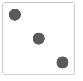
:nth-child(n)选择器:属于其父元素的第n个子元素
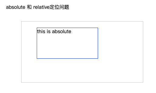
# (8).absolute和relative分别依据什么定位?
- relative依据自身定位
- absolute最近一层的定位元素定位
哪些是定位元素:absolute relative fixed,如果都没有依据body
<!DOCTYPE html>
<html lang="en">
<head>
    <meta charset="UTF-8">
    <title>定位</title>
    <style type="text/css">
        body {
            margin: 20px;
        }

        .relative {
            position: relative;
            width: 400px;
            height: 200px;
            border: 1px solid #ccc;

            top: 20px;
            left: 50px;
        }

        .absolute {
            position: absolute;
            width: 200px;
            height: 100px;
            border: 1px solid blue;


            top: 20px;
            left: 50px;
        }
    </style>
</head>
<body>
<p>absolute 和 relative定位问题</p>
<div class="relative">
    <div class="absolute">
        this is absolute
    </div>
</div>

</body>
</html>
1
2
3
4
5
6
7
8
9
10
11
12
13
14
15
16
17
18
19
20
21
22
23
24
25
26
27
28
29
30
31
32
33
34
35
36
37
38
39
40
41
42
2
3
4
5
6
7
8
9
10
11
12
13
14
15
16
17
18
19
20
21
22
23
24
25
26
27
28
29
30
31
32
33
34
35
36
37
38
39
40
41
42
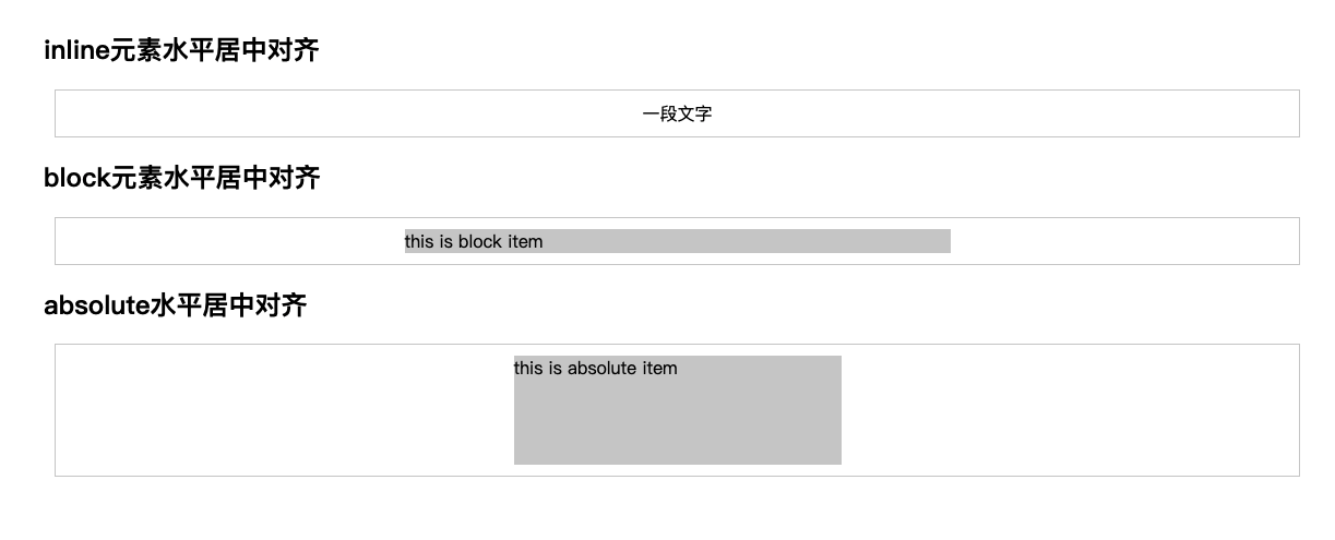
# (9).居中对齐有哪些实现方式?
- 水平居中
- inline元素: text-align: center
- block元素: margin: auto
- absolute元素: left: 50% + margin-left负值
<!DOCTYPE html>
<html lang="en">
<head>
    <meta charset="UTF-8">
    <title>水平居中</title>
    <style type="text/css">
        body {
            padding: 50px;
        }
        .container {
            border: 1px solid #ccc;
            margin: 10px;
            padding: 10px;
        }
        .item {
            background-color: #ccc;
        }
        .container-1 {
            text-align: center;
        }
        .container-2 .item {
            width: 500px;
            margin: auto;
        }
        .container-3 {
            position: relative;
            height: 100px;
        }
        .container-3 .item {
            width: 300px;
            height: 100px;
            position: absolute;
            left: 50%;
            margin-left: -150px;
        }
    </style>
</head>
<body>
<h2>inline元素水平居中对齐</h2>
<div class="container container-1">
    <span>一段文字</span>
</div>
<h2>block元素水平居中对齐</h2>
<div class="container container-2">
    <div class="item">
        this is block item
    </div>
</div>
<h2>absolute水平居中对齐</h2>
<div class="container container-3">
    <div class="item">
        this is absolute item
    </div>
</div>
</body>
</html>
1
2
3
4
5
6
7
8
9
10
11
12
13
14
15
16
17
18
19
20
21
22
23
24
25
26
27
28
29
30
31
32
33
34
35
36
37
38
39
40
41
42
43
44
45
46
47
48
49
50
51
52
53
54
55
56
2
3
4
5
6
7
8
9
10
11
12
13
14
15
16
17
18
19
20
21
22
23
24
25
26
27
28
29
30
31
32
33
34
35
36
37
38
39
40
41
42
43
44
45
46
47
48
49
50
51
52
53
54
55
56
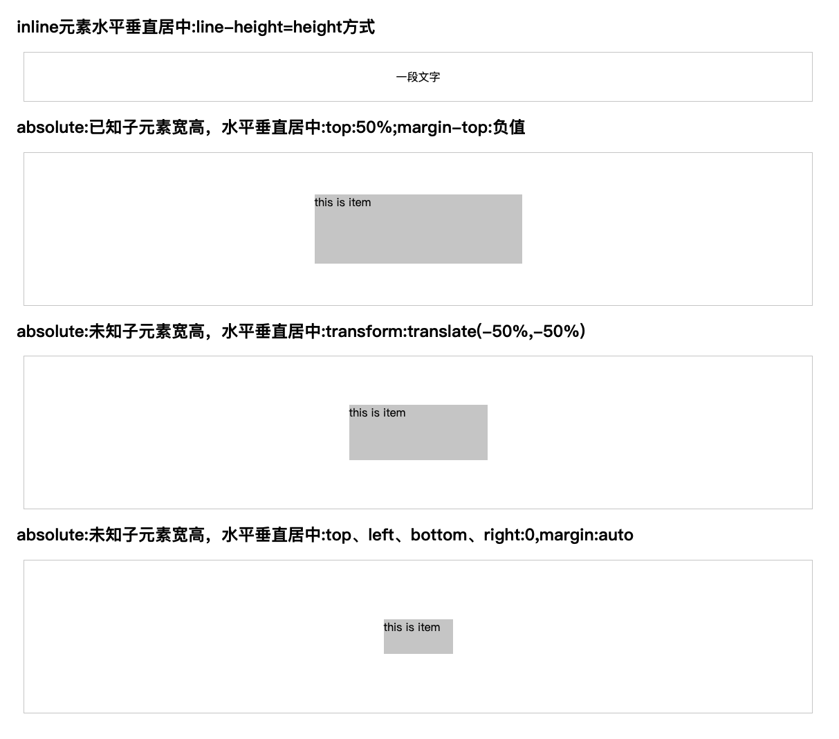
- 垂直居中
- inline元素: line-height 的值等于height值
- absolute元素: top:50% + margin-top 负值
- absolute元素: transform(-50%,-50%)
- absolute元素: top,left,bottom,right = 0 + margin:auto
<!DOCTYPE html>
<html lang="en">
<head>
    <meta charset="UTF-8">
    <title>垂直居中</title>
    <style type="text/css">
        body {
            padding: 50px;
        }
        .container {
            border: 1px solid #ccc;
            margin: 10px;
            padding: 10px;
            height: 200px;
        }
        .item {
            background-color: #ccc;
        }
        .container-1 {
            text-align: center;
            line-height: 50px;
            height: 50px;
        }
        .container-2 {
            position: relative;
        }
        .container-2 .item {
            width: 300px;
            height: 100px;
            position: absolute;
            left: 50%;
            margin-left: -150px;
            top:50%;
            margin-top: -50px;
        }
        .container-3 {
            position: relative;
        }
        .container-3 .item {
            width: 200px;
            height: 80px;
            position: absolute;
            top: 50%;
            left: 50%;
            transform: translate(-50%,-50%);
        }
        .container-4 {
            position: relative;
        }
        .container-4 .item {
            width: 100px;
            height: 50px;
            position: absolute;
            top: 0;
            left: 0;
            bottom: 0;
            right: 0;
            margin: auto;
        }
    </style>
</head>
<body>
<h2>inline元素水平垂直居中:line-height=height方式</h2>
<div class="container container-1">
    <span>一段文字</span>
</div>
<h2>absolute:已知子元素宽高,水平垂直居中:top:50%;margin-top:负值</h2>
<div class="container container-2">
    <div class="item">
        this is item
    </div>
</div>
<h2>absolute:未知子元素宽高,水平垂直居中:transform:translate(-50%,-50%)</h2>
<div class="container container-3">
    <div class="item">
        this is item
    </div>
</div>
<h2>absolute:未知子元素宽高,水平垂直居中:top、left、bottom、right:0,margin:auto</h2>
<div class="container container-4">
    <div class="item">
        this is item
    </div>
</div>
</body>
</html>
1
2
3
4
5
6
7
8
9
10
11
12
13
14
15
16
17
18
19
20
21
22
23
24
25
26
27
28
29
30
31
32
33
34
35
36
37
38
39
40
41
42
43
44
45
46
47
48
49
50
51
52
53
54
55
56
57
58
59
60
61
62
63
64
65
66
67
68
69
70
71
72
73
74
75
76
77
78
79
80
81
82
83
84
85
86
2
3
4
5
6
7
8
9
10
11
12
13
14
15
16
17
18
19
20
21
22
23
24
25
26
27
28
29
30
31
32
33
34
35
36
37
38
39
40
41
42
43
44
45
46
47
48
49
50
51
52
53
54
55
56
57
58
59
60
61
62
63
64
65
66
67
68
69
70
71
72
73
74
75
76
77
78
79
80
81
82
83
84
85
86
# (10).line-height如何继承?
<style>
body {
    font-size: 20px;
    line-height: 200%;
}
p {
    font-size:16px;
}
</style>
<body>
    <p>AAA</p>
</body>
1
2
3
4
5
6
7
8
9
10
11
12
2
3
4
5
6
7
8
9
10
11
12
p标签的line-height为40px,父元素font-size:20px * 父元素line-height:200%
- line-height写了具体数值,如30px,则继承该值
- line-height写比例,如 2/1.5,则继承该比例
- line-height写百分比,如200%,则继承计算出来的值(根据父组件计算)
# (11).rem是什么?
rem是一个长度单位
- px,绝对长度单位,最常用
- em,相对长度单位,相对于父元素,不常用
- rem, 相对长度单位,相对于根元素,常用于响应式布局
<!DOCTYPE html>
<html lang="en">
<head>
    <meta charset="UTF-8">
    <title>rem</title>
    <style type="text/css">
        html {
            font-size: 100px;
        }

        div {
            background-color: #ccc;
            margin-top: 10px;
            font-size: 0.16rem;
        }
    </style>
</head>
<body>
<p style="font-size: 0.1rem">rem 1</p>
<p style="font-size: 0.2rem">rem 1</p>
<p style="font-size: 0.3rem">rem 1</p>

<div style="width: 1rem">
    this is div1
</div>

<div style="width: 2rem">
    this is div2
</div>

<div style="width: 3rem">
    this is div3
</div>

</body>
</html>
1
2
3
4
5
6
7
8
9
10
11
12
13
14
15
16
17
18
19
20
21
22
23
24
25
26
27
28
29
30
31
32
33
34
35
36
37
2
3
4
5
6
7
8
9
10
11
12
13
14
15
16
17
18
19
20
21
22
23
24
25
26
27
28
29
30
31
32
33
34
35
36
37

# (12).响应式布局的常见方案?
- media-query(css3),根据不同的屏幕宽度设置根元素font-size
- rem,基于根元素的相对单位
<!DOCTYPE html>
<html lang="en">
<head>
    <meta charset="UTF-8">
    <!--响应式关键的一句话-->
    <meta name="viewport" content="width=device-width, initial-scale=1.0">
    <title>响应式布局</title>
    <style type="text/css">
        @media only screen and (max-width: 374px) {
            /*iphone5  或者更小的尺寸,以iphone5 的宽度(320px)比例设置 font-size*/
            html {
                font-size: 86px;
            }
        }

        @media only screen and (min-width: 375px) and (max-width: 413px) {
            /*iphone6/7/8 和 iphone x*/
            html {
                font-size: 100px;
            }
        }

        @media only screen and (min-width: 414px) {
            /*iphone6p 或者更大尺寸,以iphone6p的宽度(414px)比例设置 font-size*/
            html {
                font-size: 110px;
            }
        }

        body {
            font-size: 0.16rem;
        }

        #div1 {
            width: 1rem;
            background-color: #cccccc;
        }
    </style>
</head>
<body>
<div id="div1">
    this is div1
</div>
</body>
</html>
1
2
3
4
5
6
7
8
9
10
11
12
13
14
15
16
17
18
19
20
21
22
23
24
25
26
27
28
29
30
31
32
33
34
35
36
37
38
39
40
41
42
43
44
45
46
2
3
4
5
6
7
8
9
10
11
12
13
14
15
16
17
18
19
20
21
22
23
24
25
26
27
28
29
30
31
32
33
34
35
36
37
38
39
40
41
42
43
44
45
46
# (13). rem的弊端
rem是有阶梯性的
# (14). 网页视口的尺寸
- window.screen.height // 屏幕高度
- window.innerHeight // 网页视口高度
- document.body.clientHeight // body 高度
# (15). vw/vh
- vh 网页视口高度的 1/100
- vw 网页视口宽度的 1/100
- vmax 取两者最大值;vmin取两者最小值
上次更新: 10/21/2021, 1:52:09 PM